Description
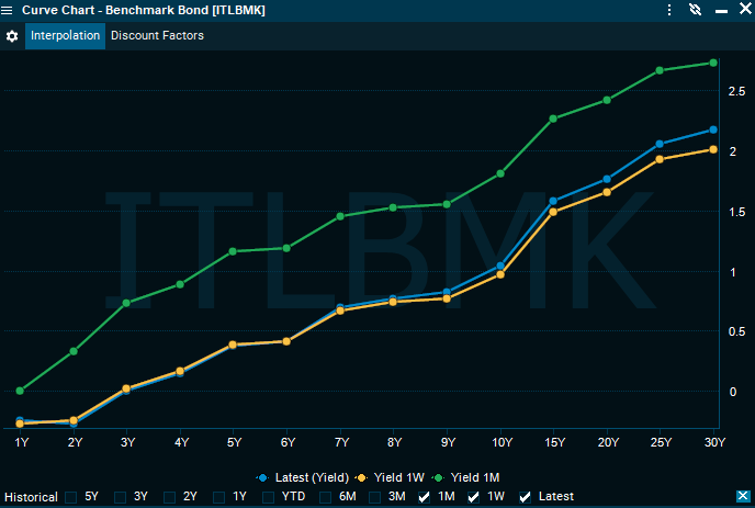
The yield line chart displays one or more instruments side-by-side in a single line chart. By default, it will display the selected instruments net change in percent. It can be configured to chart a number of historic values to quickly see the performance.
How to access
-
Go to the main menu > "Explore" > "Yield Curve" in the "Fixed Income" category and select a country from the list.
-
Right-click, for example, a benchmark bond in a "Watchlist" or a "Market Page" window and select "Charts & Visualizations" > "Curve Chart".