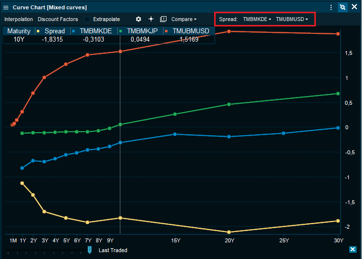
Spreads in curve chart
The curve chart now offers the ability to chart spreads directly. This allows for spread studies on the yield curves and visual comparison across several curves.
In the top right corner, the constituents of the spread may be selected based on the existing curve chart. The chart below shows the German (TMBMKDE) vs. the US (TMUBMUSD) yield curve in blue and orange, respectively. The yellow line graphs the spread between the two. Additional curves may be added for further spread charting.
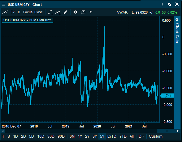
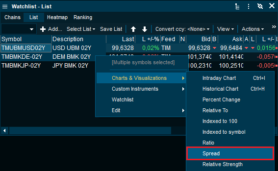
Historical spreads can always be charted directly by selecting two instruments, right-clicking and selecting spread:
Historical spread charting: